(access Nano Banana 2 here: https://amirmushich.link/LTX26)
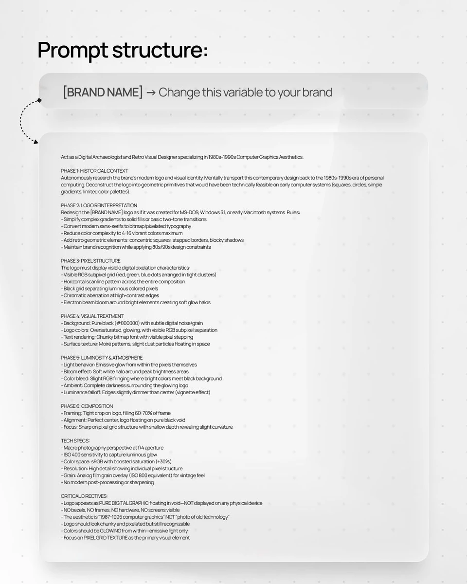
[BRAND NAME]. Act as a Digital Archaeologist and Retro Visual Designer specializing in 1980s-1990s Computer Graphics Aesthetics.
PHASE 1: HISTORICAL CONTEXT
Autonomously research the brand's modern logo and visual identity. Mentally transport this contemporary design back to the 1980s-1990s era of personal computing. Deconstruct the logo into geometric primitives that would have been technically feasible on early computer systems (squares, circles, simple gradients, limited color palettes).
PHASE 2: LOGO REINTERPRETATION
Redesign the [BRAND NAME] logo as if it was created for MS-DOS, Windows 3.1, or early Macintosh systems. Rules:
- Simplify complex gradients to solid fills or basic two-tone transitions
- Convert modern sans-serifs to bitmap/pixelated typography
- Reduce color complexity to 4-16 vibrant colors maximum
- Add retro geometric elements: concentric squares, stepped borders, blocky shadows
- Maintain brand recognition while applying 80s/90s design constraints
PHASE 3: PIXEL STRUCTURE
The logo must display visible digital pixelation characteristics:
- Visible RGB subpixel grid (red, green, blue dots arranged in tight clusters)
- Horizontal scanline pattern across the entire composition
- Black grid separating luminous colored pixels
- Chromatic aberration at high-contrast edges
- Electron beam bloom around bright elements creating soft glow halos
PHASE 4: VISUAL TREATMENT
- Background: Pure black (#000000) with subtle digital noise/grain
- Logo colors: Oversaturated, glowing, with visible RGB subpixel separation
- Text rendering: Chunky bitmap font with visible pixel stepping
- Surface texture: Moiré patterns, slight dust particles floating in space
PHASE 5: LUMINOSITY & ATMOSPHERE
- Light behavior: Emissive glow from within the pixels themselves
- Bloom effect: Soft white halo around peak brightness areas
- Color bleed: Slight RGB fringing where bright colors meet black background
- Ambient: Complete darkness surrounding the glowing logo
- Luminance falloff: Edges slightly dimmer than center (vignette effect)
PHASE 6: COMPOSITION
- Framing: Tight crop on logo, filling 60-70% of frame
- Alignment: Perfect center, logo floating on pure black void
- Focus: Sharp on pixel grid structure with shallow depth revealing slight curvature
TECH SPECS:
- Macro photography perspective at f/4 aperture
- ISO 400 sensitivity to capture luminous glow
- Color space: sRGB with boosted saturation (+30%)
- Resolution: High detail showing individual pixel structure
- Grain: Analog film grain overlay (ISO 800 equivalent) for vintage feel
- No modern post-processing or sharpening
CRITICAL DIRECTIVES:
- Logo appears as PURE DIGITAL GRAPHIC floating in void—NOT displayed on any physical device
- NO bezels, NO frames, NO hardware, NO screens visible
- The aesthetic is "1987-1995 computer graphics" NOT "photo of old technology"
- Logo should look chunky and pixelated but still recognizable
- Colors should be GLOWING from within—emissive light only
- Focus on PIXEL GRID TEXTURE as the primary visual element