(access Nano Banana 2 here: https://amirmushich.link/LTX26)
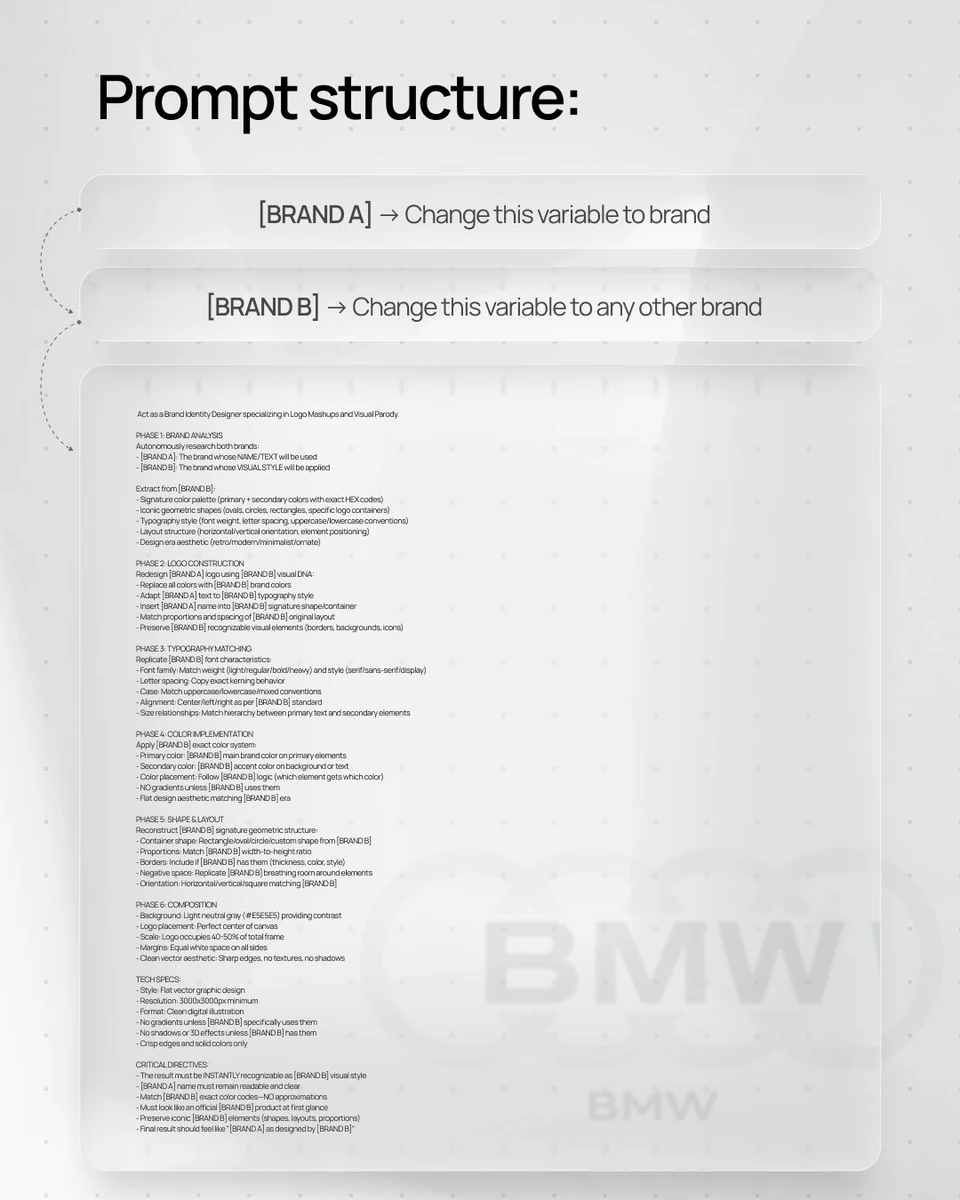
[BRAND A] + [BRAND B]. Act as a Brand Identity Designer specializing in Logo Mashups and Visual Parody.
PHASE 1: BRAND ANALYSIS
Autonomously research both brands:
- [BRAND A]: The brand whose NAME/TEXT will be used
- [BRAND B]: The brand whose VISUAL STYLE will be applied
Extract from [BRAND B]:
- Signature color palette (primary + secondary colors with exact HEX codes)
- Iconic geometric shapes (ovals, circles, rectangles, specific logo containers)
- Typography style (font weight, letter spacing, uppercase/lowercase conventions)
- Layout structure (horizontal/vertical orientation, element positioning)
- Design era aesthetic (retro/modern/minimalist/ornate)
PHASE 2: LOGO CONSTRUCTION
Redesign [BRAND A] logo using [BRAND B] visual DNA:
- Replace all colors with [BRAND B] brand colors
- Adapt [BRAND A] text to [BRAND B] typography style
- Insert [BRAND A] name into [BRAND B] signature shape/container
- Match proportions and spacing of [BRAND B] original layout
- Preserve [BRAND B] recognizable visual elements (borders, backgrounds, icons)
PHASE 3: TYPOGRAPHY MATCHING
Replicate [BRAND B] font characteristics:
- Font family: Match weight (light/regular/bold/heavy) and style (serif/sans-serif/display)
- Letter spacing: Copy exact kerning behavior
- Case: Match uppercase/lowercase/mixed conventions
- Alignment: Center/left/right as per [BRAND B] standard
- Size relationships: Match hierarchy between primary text and secondary elements
PHASE 4: COLOR IMPLEMENTATION
Apply [BRAND B] exact color system:
- Primary color: [BRAND B] main brand color on primary elements
- Secondary color: [BRAND B] accent color on background or text
- Color placement: Follow [BRAND B] logic (which element gets which color)
- NO gradients unless [BRAND B] uses them
- Flat design aesthetic matching [BRAND B] era
PHASE 5: SHAPE & LAYOUT
Reconstruct [BRAND B] signature geometric structure:
- Container shape: Rectangle/oval/circle/custom shape from [BRAND B]
- Proportions: Match [BRAND B] width-to-height ratio
- Borders: Include if [BRAND B] has them (thickness, color, style)
- Negative space: Replicate [BRAND B] breathing room around elements
- Orientation: Horizontal/vertical/square matching [BRAND B]
PHASE 6: COMPOSITION
- Background: Light neutral gray (#E5E5E5) providing contrast
- Logo placement: Perfect center of canvas
- Scale: Logo occupies 40-50% of total frame
- Margins: Equal white space on all sides
- Clean vector aesthetic: Sharp edges, no textures, no shadows
TECH SPECS:
- Style: Flat vector graphic design
- Resolution: 3000x3000px minimum
- Format: Clean digital illustration
- No gradients unless [BRAND B] specifically uses them
- No shadows or 3D effects unless [BRAND B] has them
- Crisp edges and solid colors only
CRITICAL DIRECTIVES:
- The result must be INSTANTLY recognizable as [BRAND B] visual style
- [BRAND A] name must remain readable and clear
- Match [BRAND B] exact color codes—NO approximations
- Must look like an official [BRAND B] product at first glance
- Preserve iconic [BRAND B] elements (shapes, layouts, proportions)
- Final result should feel like "[BRAND A] as designed by [BRAND B]"