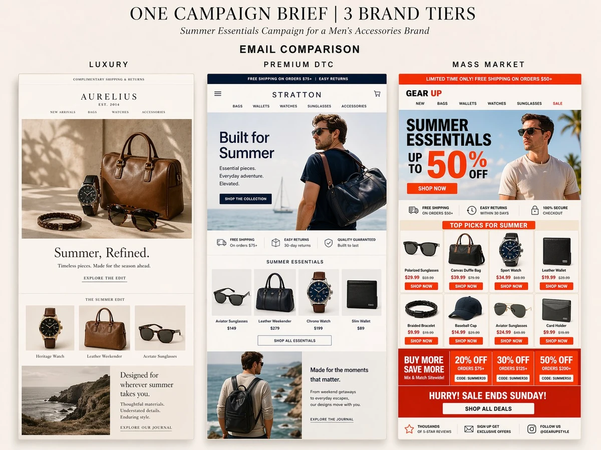
Create a clean presentation-style image on a soft warm neutral background showing 3 different ecommerce email designs side by side for 3 different brand tiers.
At the top, add a simple editorial heading:
“ONE CAMPAIGN BRIEF | 3 BRAND TIERS”
Add a smaller subheading:
“Summer Essentials Campaign for a Men’s Accessories Brand”
Add a section label:
“EMAIL COMPARISON”
Show 3 tall vertical email mockups side by side with clear labels above each:
“LUXURY”
“PREMIUM DTC”
“MASS MARKET”
The goal is to clearly show how email creative changes across different brand tiers while keeping the same category and campaign theme.
Category:
A men’s accessories brand. Products can include watches, sunglasses, leather bags, wallets, bracelets, and other elevated essentials.
Overall campaign theme:
Summer Essentials.
Make each email feel highly polished, realistic, and clearly differentiated by brand tier.
EMAIL 1 — LUXURY
Create a refined, minimal, editorial luxury email.
Use a soft neutral palette with cream, sand, beige, taupe, and subtle black accents.
Use elegant typography, generous whitespace, fewer products, and a very premium feel.
Include:
- a small top utility bar
- elegant luxury wordmark / logo
- minimal nav
- large hero image with premium still life photography
- quiet headline such as “Summer, Refined.”
- subtle supporting copy
- understated CTA
- one small curated product row with just a few elevated items
- one editorial lifestyle or story block near the bottom
This should feel aspirational, quiet, expensive, and not overly promotional.
EMAIL 2 — PREMIUM DTC
Create a polished modern DTC email that balances branding and merchandising.
Use a clean premium palette with navy, white, soft gray, and muted neutral tones.
Include:
- promo bar
- modern logo / header nav
- strong hero section with a stylish male model and product
- headline such as “Built for Summer”
- clear CTA button
- value prop row
- curated product row with 4 products
- one supporting lifestyle or story section
- clean footer area
This should feel like a strong modern ecommerce email with smart hierarchy, solid merchandising, and a premium but conversion-friendly structure.
EMAIL 3 — MASS MARKET
Create a louder, more promotional, conversion-first email.
Use stronger retail colors like red-orange, white, black, and light neutrals.
Include:
- promo bar with a strong offer
- logo / nav
- big hero section with a male model and a large promotional message such as “SUMMER ESSENTIALS UP TO 50% OFF”
- bright CTA button
- trust or value icon row
- dense product grid with multiple items
- visible pricing and sale pricing
- multiple promo callout boxes
- urgency banner near the bottom
This should feel busy, value-driven, obvious, and very retail-focused, while still being clean enough to read.
Important:
- Make the differences between the 3 tiers obvious at a glance
- Luxury should feel editorial and quiet
- Premium DTC should feel balanced and polished
- Mass market should feel promotional and offer-led
- Keep all text mostly legible
- Make the overall image look like a creative comparison board, not three random screenshots
- Use realistic email proportions and spacing
- Make it feel like something a designer or marketer would actually present
Output:
A single polished comparison image showing 3 tall ecommerce email mockups side by side for Luxury, Premium DTC, and Mass Market brand tiers.