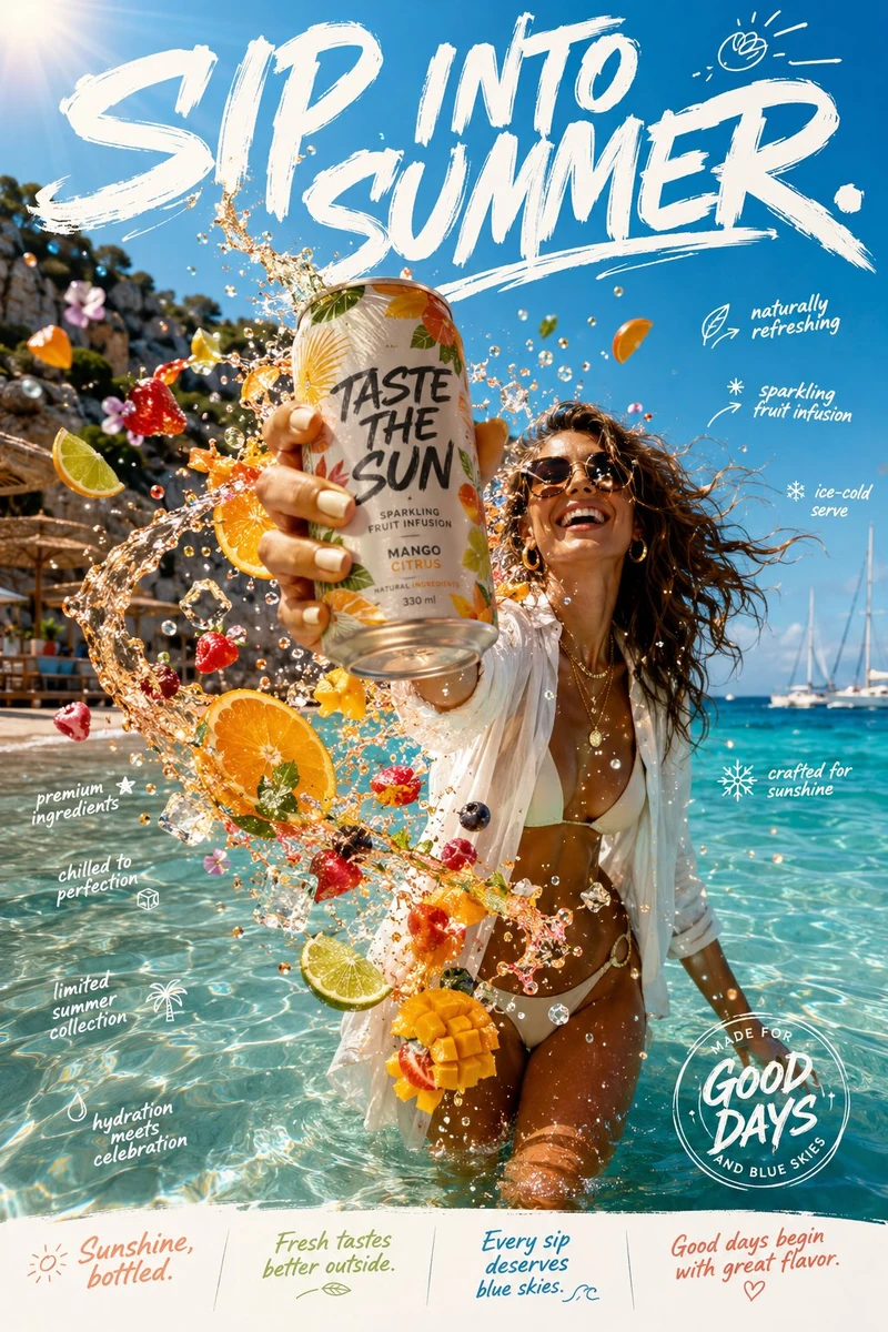
Create an ultra-premium lifestyle beverage campaign titled:
TASTE THE SUN.
This is not a conventional canned drink advertisement.
It should feel like the visual embodiment of endless summer—carefree, vibrant, stylish, and effortlessly aspirational.
The composition captures a confident young woman standing knee-deep in the crystal-clear shallows of a secluded Mediterranean cove during peak golden afternoon. She is dressed in a modern resort look: a flowing linen shirt loosely draped over a minimalist swimsuit, layered gold jewelry catching the sunlight, oversized sunglasses, and windswept hair glowing against the sea breeze.
She isn't posing.
She's laughing naturally after taking a refreshing sip from an elegantly designed fruit-infused sparkling beverage can, held dramatically close to the camera through cinematic forced perspective so the product becomes the unmistakable hero of the image.
The instant the can is tilted, the beverage transforms into an explosion of liquid summer.
Instead of ordinary splashes, vibrant streams of sparkling fruit essence spiral around her—bursting citrus slices, suspended berries, translucent mango cubes, mint leaves, edible flowers, crushed ice crystals, shimmering droplets, and sunlit bubbles floating weightlessly through the air. Everything feels energetic yet refined, like a luxury fragrance campaign interpreted through fresh fruit.
The turquoise sea stretches endlessly into the horizon while sailboats drift in soft focus. Palm shadows dance across pale limestone cliffs, woven beach umbrellas, and polished wooden decking. The atmosphere radiates warmth, freedom, and effortless sophistication.
---
TYPOGRAPHY
Typography is expressive, playful, and fashion-forward—integrated into the composition rather than sitting on top of it.
The dominant headline spans the upper portion of the campaign in oversized hand-painted brush lettering:
SIP INTO SUMMER.
Supporting campaign copy:
Sunshine, bottled.
Fresh tastes better outside.
Every sip deserves blue skies.
Good days begin with great flavor.
Graphic callouts appear organically around the composition:
• naturally refreshing
• sparkling fruit infusion
• ice-cold serve
• crafted for sunshine
• premium ingredients
• chilled to perfection
• limited summer collection
• hydration meets celebration
Minimal geometric dividers, handwritten doodles, circular stamps, subtle brush strokes, fruit-inspired icons, and editorial graphic accents create a youthful yet premium campaign identity.
---
COLOR PALETTE
Ocean turquoise
Mediterranean blue
Coral pink
Sunset orange
Fresh lime green
Golden sunlight
Crisp white
Natural fruit tones
Highly saturated yet elegant color grading.
---
PHOTOGRAPHY & ART DIRECTION
Luxury beverage advertising
Premium lifestyle editorial
International summer campaign
Large-format commercial photography
Natural sun flare
Ultra-realistic fruit textures
Photorealistic liquid physics
Crystal-clear ice
Authentic skin texture
Soft cinematic depth of field
Award-winning food styling
High dynamic range
Hyper-detailed product rendering
8K ultra-high resolution
Every droplet should sparkle with realism. Every fruit element should feel freshly sliced. The product should command immediate attention while the overall image communicates joy, warmth, and aspirational summer living.
The final campaign should feel like a flagship global launch seen across beach clubs in Ibiza, rooftop billboards in Miami, luxury resorts in Santorini, and premium retail displays worldwide—vibrant, sophisticated, and irresistibly refreshing.